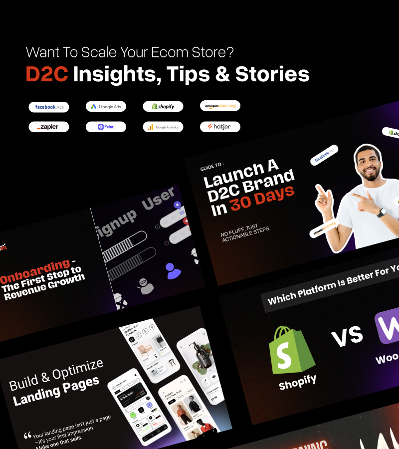
D2C growth secrets, dropped in your inbox
We write what D2C founders should actually care about
Landing Page Optimization Checklist for D2C Brands
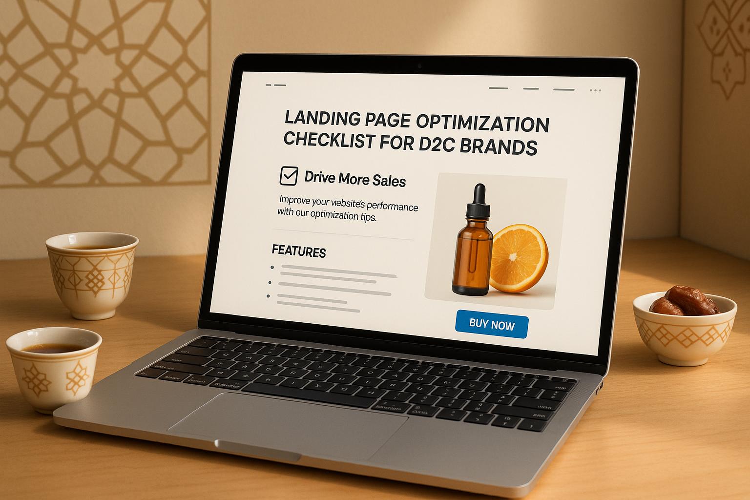

Want to boost your D2C brand's sales? Your landing page might be the key.
A well-optimized landing page can help you turn visitors into paying customers - especially in the UAE, where mobile shopping and high consumer expectations dominate. Here’s the bottom line:
- Clear messaging and headlines grab attention and guide users.
- Fast mobile performance ensures you don’t lose customers to slow loading times.
- Trust-building elements like reviews, payment icons, and local delivery info increase conversions.
- Effective CTAs (Call-to-Actions) drive action when placed strategically.
- Localization (like AED pricing and UAE-specific visuals) makes your page relevant to local shoppers.
Start by addressing these areas to see measurable improvements in your conversion rates. Let’s dive into actionable steps you can implement today.
What Your Landing Page Is Doing Wrong
Writing Clear Headlines and Messages
Your headline is the gateway to your content - it’s the first thing visitors notice, and it often determines whether they stick around or leave. A strong headline grabs attention and sets the tone, clearly conveying what value lies ahead. It’s the starting point for the customer journey, and the messaging that follows must build on this momentum.
Every word matters. Your messaging should convince visitors that your product or service solves their problem. When your communication is clear and consistent, visitors quickly understand what you’re offering and why it matters to them. Let’s explore how to craft headlines that not only attract attention but also drive conversions.
Writing Headlines That Convert
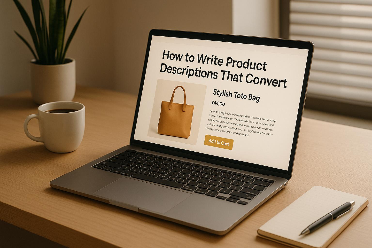
Highlight benefits over features. Don’t just tell people what your product does - show them how it makes their lives better. Instead of listing technical specs, focus on outcomes. For instance, rather than saying, "Advanced skincare formula", try, "Get visibly smoother skin in just 14 days."
Be specific and measurable. Vague promises like "better results" don’t inspire trust. Instead, use concrete numbers and timeframes to make your claims believable. For example, "Cut your delivery costs by 40% in a month" is far more compelling than "Save money on shipping."
Align with search intent. If someone is searching for "organic baby food Dubai", your headline should immediately confirm they’re in the right place. Something like "Certified Organic Baby Food Delivered Fresh Across Dubai" speaks directly to their needs.
Incorporate action-driven power words. Words like "instant", "proven", "exclusive", and "guaranteed" add urgency and credibility. For example, "Only 48 hours left: Free shipping across the UAE" creates a sense of urgency, while "Get fresh groceries delivered in 2 hours" highlights convenience. Just make sure you can back up these claims with solid evidence.
Address local concerns. In the UAE, delivery reliability and product authenticity are often top priorities. Headlines like "100% Authentic Products with Same-Day Delivery in Dubai" address these concerns head-on, building trust with your audience.
Keeping Messages Consistent
Once your headline grabs attention, the rest of your page must deliver on the promise it makes.
Stick to consistent language. If your headline describes your product as "premium", avoid switching to terms like "luxury" or "high-end" later on. Consistency reinforces trust and avoids confusion.
Align your ad copy with your landing page. If your ad promotes "free installation", visitors should see that offer prominently displayed on your landing page. Mismatched messaging can feel misleading and cause visitors to leave.
Maintain a unified tone of voice. A playful, casual headline followed by formal, corporate messaging creates a disconnect. Choose a tone that resonates with your audience - whether it’s friendly, professional, or quirky - and use it consistently throughout.
Reinforce your value proposition multiple times. Your main benefit should appear in the headline, be explained in the body text, and show up again in the call-to-action. Repetition ensures visitors remember why they should choose you.
Tackle objections step by step. Start with your strongest benefit in the headline, then use the rest of the page to address potential concerns. For example, if you’re selling supplements, lead with the results they deliver, then follow up with details about safety certifications and ingredient quality.
Connect features to benefits. Don’t just list features - explain why they matter. For example, instead of simply stating "Waterproof rating IP68", add, "so you can confidently use it at the beach or pool."
The goal is to create a seamless, logical flow that guides visitors from curiosity to confidence. When your messaging consistently reinforces your value and addresses concerns, visitors are more likely to trust you and make a purchase.
Building Visual Layout and Structure
A strong visual hierarchy works hand-in-hand with your messaging to ensure every element on your page encourages conversions. A thoughtfully designed layout naturally guides visitors from the headline to the call-to-action (CTA), fostering engagement. On the flip side, a cluttered or poorly organised layout can confuse users and drive them away.
The placement and arrangement of your page elements aren’t just about looking good - they’re about understanding how users behave. People tend to scan pages in predictable patterns, so aligning your layout with these habits ensures a smoother path to conversion.
Placing Key Content Above the Fold
The area of your page visible without scrolling - commonly referred to as "above the fold" - is your most valuable space. This is where you need to grab attention and clearly communicate what your page offers.
To make the most of this space, include four key elements:
- A primary headline that clearly states your value proposition.
- A supporting subheadline to provide context and detail.
- A hero visual that reinforces your message and catches the eye.
- A single, prominent CTA button to guide visitors toward the next step.
For instance, a headline like "Get glowing skin with natural ingredients - delivered fresh to your door in 2 hours" not only highlights the benefits but also aligns with local expectations. This clarity ensures visitors instantly understand what you’re offering and why it’s relevant.
Avoid cluttering this space with distractions like excessive links, multiple CTAs, or global navigation menus. These elements can create "page leaks", drawing attention away from your primary goal.
Using Visual Elements to Guide Users
Good design subtly directs users where you want them to go. Choosing the right layout pattern is a great starting point:
- F-shaped layouts work best for content-heavy pages. They guide the eye through prominent headings and left-aligned sections, making detailed information easy to scan.
- Z-shaped layouts are ideal for simpler, visually-driven pages. They naturally lead the viewer’s gaze from the headline to the visual and then to the CTA.
Incorporate directional cues to reinforce this flow. For example, position a hero image so that the subject’s gaze points toward the CTA, or use diagonal lines and shapes to nudge attention in the right direction.
Whitespace is another powerful tool. Surround your CTA with enough empty space to make it stand out, and use contrasting colours to draw the eye. Ensure each section of your page has a clear purpose, keeping the visitor focused on one primary action at a time - a principle often referred to as maintaining a 1:1 attention ratio.
| Layout Pattern | Best For | Key Elements | Validation Method |
|---|---|---|---|
| F-shaped | Content-heavy pages | Prominent headings, scannable sections, left-aligned text | Heatmaps or scroll maps |
| Z-shaped | Visual-first pages | Large hero images, clear flow to CTA, concise text | Heatmaps or A/B testing |
Adding Interactive Product Displays
Interactive elements can take your design to the next level by engaging users in ways static visuals can’t. These features allow visitors to see your product in action, making it easier to understand its benefits. For example, short demo videos can showcase how a product works, while 360-degree views are particularly effective for physical items like fashion, electronics, or home goods.
To ensure these elements enhance rather than hinder user experience, optimise them for fast loading. If performance issues arise, consider using click-to-activate features so interactive content doesn’t slow down the page.
Position interactive elements next to benefit-driven statements to strengthen your message without overwhelming users. For instance, a "Tap to see in action" label makes it clear that interactivity is available but optional. This way, users who prefer a quicker browsing experience won’t feel forced to engage with these features.
Finally, use tools like heatmaps and scroll maps to track whether visitors are engaging with your interactive content and following your intended visual flow. This helps you fine-tune your layout for maximum impact, ensuring your page delivers a seamless and engaging experience.
Optimizing Mobile Performance and Loading Speed
In the UAE, where smartphone usage is high and mobile commerce is booming, ensuring your landing page performs well on mobile devices is a must. A slow or clunky page can quickly drive potential customers away, especially during peak shopping seasons like the Dubai Shopping Festival or Ramadan when mobile traffic surges. A fast, responsive mobile experience keeps users engaged and helps protect your sales.
Making Pages Work on Mobile Screens
To create a mobile-friendly landing page, focus on touch interactions and vertical scrolling. Start by ensuring interactive elements - like buttons and links - are easy to tap. Make them large enough and spaced out properly, so they work comfortably for all users, even those with larger fingers.
Typography is another key factor. Use bold, easy-to-read fonts for headlines, and ensure body text is legible for users of all ages, including older audiences. Good readability enhances the overall user experience.
When designing layouts, think about how users hold their phones. Place critical call-to-action buttons (like "Buy Now" or "Sign Up") in areas that are easy to reach with one hand. And when it comes to forms, keep them short and simple. Stick to essential fields like name, phone number, and email, and use input types that automatically bring up the right keyboard for mobile users.
Making Pages Load Faster
Speed is everything on mobile. Start by optimising images - use modern formats like WebP and compress them to balance quality and file size. This way, your products still look great without slowing down the page.
Lazy loading is another smart move. It delays loading images until they’re actually needed, cutting down initial load times. For faster rendering, inline critical CSS directly in the HTML so that important content appears quickly, while secondary styles load in the background.
Third-party scripts, like analytics tools or chat widgets, can also slow things down. Load these scripts asynchronously or delay them until the main content has loaded. Lastly, use a Content Delivery Network (CDN) with regional servers to reduce latency. Serving content from servers closer to your UAE audience ensures faster load times.
Testing Across Different Devices
Once your page is optimised, test it thoroughly on a range of devices. The UAE has a diverse mix of smartphones and tablets, so it’s important to check how your page performs across various screen sizes and operating systems. Also, keep in mind that network conditions can vary - some areas enjoy fast connections, while others don’t. Testing under different network conditions ensures your page works well for everyone.
Don’t forget browser compatibility. Test your page on popular browsers like Safari and Chrome, as well as lesser-used ones, to catch any potential issues. Physical device testing is particularly useful - it can reveal quirks in touch interactions, scrolling, and forms that desktop simulations might miss.
Finally, use performance monitoring tools to track real-user data. Regular testing and performance reviews help you maintain a smooth, high-quality experience as you update your page with new content or features. By staying on top of these optimisations, you can ensure your landing page keeps delivering results.
Building Trust with Social Proof
Once you've fine-tuned your design and performance, the next step is to build trust through genuine social proof. Social proof works by showcasing real customer experiences, turning your landing page into more than just a sales pitch - it becomes a credible recommendation.
For D2C brands, this is especially important. You're often competing with established retailers and big-name brands. When someone stumbles upon your product for the first time, they need reassurance that others have had positive experiences. Smart placement of reviews, testimonials, and trust signals can be the key to converting curious visitors into loyal customers.
Here’s how to effectively display reviews and security signals to earn the trust of UAE shoppers.
Displaying Customer Reviews and Testimonials
Authenticity is non-negotiable when it comes to customer reviews. Avoid showcasing only glowing five-star reviews; instead, include a balanced mix that reflects real experiences. Highlight reviews that share specific details, like how your product solved a problem or exceeded expectations. For UAE customers, reviews mentioning delivery to cities like Dubai, Abu Dhabi, or Sharjah can help them picture their own potential experience.
Place your best testimonials right after the headline. If possible, include photos of the customers - real faces create a stronger sense of trust than anonymous text. Adding names and locations, such as “Sarah from Dubai” or “Ahmed from Sharjah,” helps build a local connection that resonates with UAE shoppers.
Star ratings should be easy to spot, ideally placed near product images and pricing. If you’ve got a substantial number of reviews, display the overall rating alongside the total count, e.g., “4.8 stars from 1,247 reviews.” This combination of a high rating and a large volume of feedback is a powerful trust builder.
For high-value products, video testimonials can work wonders. A short 30-second clip of a happy customer explaining their experience carries more weight than text alone. These videos are especially effective for beauty, fitness, or lifestyle products, where results can be visually demonstrated.
Keep your reviews fresh. Highlight recent feedback to show that your business is active and consistently satisfying customers. If you receive reviews in Arabic, display them alongside English ones to reflect your commitment to serving the local community.
Adding Security Badges and Payment Icons
For UAE shoppers, familiar local payment options and transparent return policies are key to building trust.
Place security badges prominently near your checkout button and payment forms. Display SSL certificates, secure payment icons like Visa and Mastercard, and logos for local payment methods such as Emirates NBD. These symbols reassure customers that their transactions are safe.
Make your money-back guarantee stand out. Instead of hiding it in fine print, feature it boldly on your landing page. For example, use phrases like “30-day money-back guarantee” or “Free returns across the Emirates” to instill confidence.
Delivery and service badges can further enhance trust. If you offer same-day delivery in Dubai or next-day delivery across the UAE, highlight this with badge-style graphics. Mention partnerships with well-known delivery services that UAE customers recognise and trust.
Show off your certifications and awards. If your products are certified halal, organic, or meet specific quality standards, display these certifications as visual badges. Awards from respected organisations or positive mentions in the media can also be formatted as trust badges and placed in a dedicated section.
Finally, make your contact information easy to find. Display your UAE phone number, physical address (if applicable), and customer service hours in a prominent spot. A “Chat with us” button showing real response times can further demonstrate that there’s a reliable team behind your brand, ready to assist customers at any moment.
sbb-itb-4bf3ff8
Creating Effective CTAs and Content
Your CTAs (Call-to-Actions) and content play a pivotal role in turning visitors into customers. Even the most visually stunning design and lightning-fast load times won't convert if your CTAs fail to guide visitors toward action.
A great CTA isn’t just about bold text or bright colours. It’s about understanding your audience - where they are in their buying journey - and delivering the right message at the right time. For D2C brands targeting UAE customers, this means crafting CTAs and content that feel relevant and local, while still being clear and persuasive.
Placing CTAs in the Right Spots
The placement of your CTA is just as important as the message itself. Start by positioning your primary CTA above the fold, where it’s immediately visible without scrolling. This is crucial since visitors often decide within seconds whether to stay on your page. A clear, prominent CTA helps guide their next step.
Reinforce your primary CTA at key points throughout the page - after highlighting benefits, following testimonials or social proof, near pricing details, and at the very end. This repetition isn’t overkill; it’s strategic. Different visitors will feel ready to act at different moments, and having a CTA available when they’re convinced can make all the difference.
Stick to a single primary goal to avoid distractions. While secondary CTAs like "Learn More" or "See How It Works" can be useful, place them below your main action and ensure they don’t compete for attention.
For mobile users, make sure your buttons are easy to tap. A height of at least 44 pixels with enough spacing around the button ensures a seamless experience.
Also, consider how visitors naturally scan your page. Many follow F-shaped or Z-shaped visual patterns, so position your CTAs along these pathways to maximise engagement. But placement alone won’t drive clicks - your words have to do the heavy lifting.
Writing CTAs That Get Clicks
Once your CTA is in the right spot, the next step is to craft a message that motivates action. Avoid generic phrases like "Submit" or "Click Here." Instead, use specific, benefit-driven language that speaks directly to your audience. For UAE customers, this might mean phrases like "Get Free Next-Day Delivery in Dubai", "Claim AED 50 Off Today", or "Start Your 30-Day Free Trial."
Tailor your CTA to match where your visitor is in their decision-making process. For someone just discovering your brand, softer calls like "Download the Guide" or "Learn More" may work better. For those comparing options, try "Check Stock Near You" or "Compare Features." When they’re ready to buy, go straight to the point with "Buy Now" or "Checkout Securely."
Urgency can also be a powerful motivator, but only when it’s genuine. Use phrases like "Limited Stock - Order Now" or "Offer Ends Tonight" to encourage immediate action. Just be sure not to overuse these tactics unless they’re accurate.
Adding reassurance near your CTA can help overcome hesitation. Short phrases like "30-Day Returns", "Secure Payment", or "Ships Next Business Day in UAE" can address common concerns. For even more local relevance, include options like "Cash on Delivery Available" or "Arabic Support Available."
Finally, reflect local payment preferences in your CTA. Instead of a generic "Buy Now", consider something like "Pay Securely in AED" to align with popular UAE payment methods and reduce friction.
Keeping Content Simple and Clear
Your CTAs are most effective when supported by clear, uncluttered content. Start with a strong headline that immediately communicates your value. Use short sentences, conversational language, and an active voice to keep your message easy to digest.
Break your content into scannable chunks. Use bullet points to highlight key benefits, add descriptive subheadings, and avoid overwhelming visitors with long paragraphs. Remember, most people decide whether to engage based on the headline alone, so make it count by front-loading your most compelling information.
Consistency matters too. If your ad promises "Free Delivery Across UAE", ensure that same message is prominently displayed on your landing page. A mismatch between ad and page can confuse visitors and increase bounce rates.
Simplify choices and keep forms short. Every extra field or option adds mental effort, so focus only on what’s essential to drive conversions.
Use clear, relatable language that feels local yet professional. Avoid slang that might not translate well and instead use phrases like "Same-Day Delivery in Dubai" or "Free Returns Across the Emirates" to build trust and connection.
Lastly, focus on benefits rather than features. Instead of saying "Advanced Filtration System", explain the outcome: "Cleaner Water in Every Glass." This approach helps visitors see how your product improves their lives, nudging them closer to clicking that CTA and completing their purchase.
Adapting for UAE Customers
To connect with UAE customers effectively, your landing page must reflect local preferences. This means using the correct AED currency format and incorporating visuals that resonate with the local audience. By aligning your pricing and imagery with UAE norms, you'll create a more trustworthy and appealing experience.
Using AED Currency and Local Formats
Getting the currency format right is non-negotiable when catering to UAE customers. Displaying prices in US dollars or using incorrect dirham formats can make your site feel foreign and untrustworthy. Since 2025, the UAE has introduced a new symbol for the dirham - a "D" with two horizontal lines - but most brands still stick to the traditional "AED" format.
For consistency and familiarity, it's best to use "AED" when showing prices. For instance:
- Whole numbers: AED 55,000
- Including fils: AED 55,000.55
A basic product might be priced at AED 190, while a high-end luxury item could appear as AED 108,000. This attention to detail in pricing presentation helps establish credibility with your audience.
Using Local Images and Language
Visuals play a huge role in connecting with UAE customers. Images that feature local landmarks like Dubai’s iconic skyline or Abu Dhabi’s architectural highlights make your content relatable and relevant. These visuals serve as subtle cues that your brand understands and values the local culture.
However, this doesn’t mean every image must feature traditional attire. Instead, aim for visuals that reflect everyday life in the UAE. High-quality images that showcase modern lifestyles, along with clear product details, can effectively grab attention. Video content is another powerful tool - it gives customers a closer look at your product and demonstrates how it fits seamlessly into their lives.
Testing and Improving Your Pages
Improving your landing page isn’t something you do just once and forget about. The most successful D2C brands are always testing and tweaking their pages based on how users interact with them. This continuous process helps pinpoint what’s working, what’s not, and where you can make changes to boost conversions.
Collecting User Feedback
User feedback offers insights that analytics alone can’t provide. Tools like on-site surveys and exit pop-ups are great for gathering this information.
On-site surveys are most effective when they’re short and focused. A simple question like, "What’s stopping you from making a purchase today?" can uncover pain points you might not have considered. To maximise responses, trigger these surveys after 30 seconds on a product page or when users show exit intent.
Exit pop-ups, while sometimes seen as intrusive, can be valuable if used thoughtfully. Instead of just offering discounts, use them to learn why visitors are leaving. Questions like, "Were you looking for something specific?" or "What could we do to improve your experience?" can provide actionable insights to address common issues.
Timing is everything when it comes to feedback requests. Visitors who’ve spent more time on your site or browsed multiple pages are more likely to give meaningful responses. Once you’ve collected their input, use A/B testing to experiment with changes based on these insights.
Running A/B Tests
A/B testing is a powerful way to make decisions based on actual data instead of guesswork. The key is to test one element at a time so you can clearly see what’s driving any changes.
Start with headlines. Test different approaches - one might highlight a product benefit, while another leans on urgency or social proof. For instance, a skincare brand could compare "Transform Your Skin in 30 Days" with "Join 10,000+ Happy Customers" to see which resonates more.
Call-to-action buttons are another great area to test. Beyond tweaking the text (e.g., from "Buy Now" to "Get Yours Today"), experiment with button colours, sizes, and placement. A bright orange button might perform better than a standard blue one, or moving the button above the fold could boost clicks.
Page layouts can also influence user behaviour. You could test a single-column design versus a two-column layout, or rearrange product images and descriptions to see what works best. The goal is to run tests until you gather enough data to make confident decisions.
After making adjustments based on your tests, keep an eye on your metrics to measure the overall impact.
Tracking Performance Numbers
Metrics tell the story of how your landing page is performing, but knowing which ones to focus on is crucial. While conversion rate is a top priority, other metrics like bounce rate and engagement time can reveal deeper insights.
A high bounce rate (above 70%) might suggest that your page doesn’t meet visitors’ expectations or that it’s loading too slowly. For D2C brands, a bounce rate between 40-60% is more typical.
Time on page is another key indicator. Visitors who spend 2-3 minutes on your product page are usually engaged, but if they’re staying much longer, they might be struggling to find what they need.
Scroll depth shows how far down the page users are going. If most visitors aren’t scrolling past the hero section, you may need to make your opening content more engaging or move critical information higher up. On the other hand, if people are scrolling all the way down but not converting, your call-to-action might need a rethink.
To track these metrics effectively, set up goal tracking in your analytics platform. Monitor actions like email sign-ups, product page visits, and completed purchases. This helps you map out how users move through your funnel and identify where they’re dropping off.
Review your metrics weekly to spot short-term trends, and do a deeper dive monthly to evaluate the impact of your changes. Remember, the ultimate goal is increased sales. If your bounce rate improves but conversions don’t, it’s time to dig deeper and figure out why.
Conclusion: Your Next Steps to Better Conversions
Optimising your landing page is not a one-time task - it’s an ongoing process that requires consistent testing and tweaking. Think of this checklist as your starting point. Implement each strategy step by step, and carefully track the results to see what resonates with your audience.
Start with the basics: clear, attention-grabbing headlines, fast mobile loading times, and well-placed call-to-action buttons (CTAs). These elements often lead to the most noticeable increases in conversion rates, particularly for D2C brands just beginning their optimisation journey.
For the UAE market, localisation plays a key role in building trust. Use prices in AED, incorporate visuals that reflect local preferences, and include payment options that are popular in the region. These small but meaningful details can make a big difference in how UAE shoppers perceive your brand and, ultimately, in their willingness to convert.
When testing, focus on one change at a time. This approach allows you to pinpoint what’s driving improvements. For instance, if your analytics show visitors leaving after just a few seconds, revisit your opening message. If they’re scrolling through your page but not converting, take a closer look at your CTA placement and wording. Let the data guide your adjustments.
Remember, the best-performing D2C brands treat landing page optimisation as an ongoing dialogue with their customers. They listen to feedback, adapt to shifting preferences, and refine their strategies based on real-world results. By combining thoughtful design, solid performance, and localisation, you can transform your landing page into a powerful tool for conversions.
What’s next? Choose three items from this checklist to tackle this week. Whether it’s showcasing customer testimonials, improving mobile speed, or testing a new headline, action beats overthinking. Start small, measure the impact, and build on those successes to keep the momentum going.
FAQs
How can I optimise my landing page to appeal to customers in the UAE?
To engage effectively with customers in the UAE, tailor your landing page to reflect local preferences and cultural nuances. Display prices in AED (د.إ) to ensure clarity and familiarity, and make your content accessible in both English and Arabic to accommodate the region's linguistic diversity. Emphasise UAE-specific advantages, like quick delivery within the country or exclusive local promotions, to establish trust and relevance.
Keep the design sleek and professional, reflecting the aesthetic preferences of the UAE audience. Make sure the page is fully optimised for mobile devices, as mobile shopping is extremely popular in the region. Adding local testimonials or success stories can further strengthen credibility and create a stronger connection with your audience.
How can I use social proof on my landing page to build trust with customers?
Using social proof on your landing page is a smart way to build trust and establish credibility. Start by featuring authentic customer testimonials, reviews, and star ratings. These provide a direct glimpse into the experiences of real users.
You can also include case studies, client logos, or awards to show your brand’s reliability and expertise. Adding user-generated content - like photos or videos shared by your customers - or showcasing media mentions can make your page feel even more relatable and trustworthy.
If it fits your business, share impactful success stories or highlight key customer metrics to illustrate the value of your product or service. These elements work together to instil confidence and motivate visitors to take the next step.
What are the best ways to test and improve my landing page to boost conversions over time?
To make your landing page work harder and boost conversions, start by implementing A/B testing. This involves testing different versions of key elements like your headlines, call-to-action buttons, and page layouts. The goal? To figure out which version connects best with your audience. Tools like heatmaps and user session recordings can give you a clearer picture of how visitors interact with your page, helping you spot areas that need improvement.
Keep a close eye on important metrics like click-through rates, page load times, and bounce rates. Analysing this data regularly allows you to fine-tune your design, content, and overall user experience. By constantly tweaking and improving your landing page to align with your D2C brand’s objectives, you’ll not only engage your visitors better but also steadily increase your conversion rates.
Related Blog Posts


Join hundreds of D2C Founders getting actionable nuggets every week. No fluff, just results.
Join our newsletter to receive the latest insights, tips, and stories directly to your inbox weekly.
Your One Stop D2C Knowledge Hub. Actionable insights which get you results.

.avif)